
Summarize Blog
Quick Summary
Explore how burndown charts help Agile teams track sprint progress, spot delays early, and enhance collaboration between QA and developers
A burndown chart is a visual tool that tracks the remaining work in a project or sprint against the time allocated to complete it.
Commonly used in Agile testing and project management, it provides teams and stakeholders with a clear, quantitative snapshot of progress. By plotting the work left to do versus the time remaining, burndown charts help teams monitor whether they are on track to meet their sprint goals and deadlines.
In Agile testing, where iterative development and continuous delivery are essential, burndown charts become invaluable for tracking the completion of testing tasks and identifying any bottlenecks early. They enable teams to adjust priorities, allocate resources efficiently, and maintain transparency throughout the sprint lifecycle.
This blog will cover all aspects of burndown charts: defining what they are, explaining their importance, and highlighting common challenges teams face when using them.
What Is a Burndown Chart?

A burndown chart is a visual project management tool used in Agile and Scrum frameworks to track the progress of work over time. It’s especially useful in sprint-based workflows, where teams need to monitor whether they are on track to complete their goals within a defined timebox.
Imagine you have a mountain of work (say, 150 test cases) to complete in a sprint. A burndown chart helps you visualize how fast that mountain is shrinking day by day. It’s a line chart where:
- The X-axis represents time (days in a sprint or testing phase).
- The Y-axis represents work remaining (like test cases or story points).
As testing progresses, the number of remaining test cases ideally drops thus, the chart “burns down” toward zero.
Purpose in Agile, Scrum, and Testing
In Agile and Scrum, burndown charts serve as a real-time tracking mechanism to:
- Provide visibility into work progress.
- Highlight whether the team is on track to meet the sprint goal.
- Help product owners and QA leads make informed decisions early.
In software testing, particularly in QA-focused sprints, test case execution burndown charts help answer questions like:
- Are we on track to complete test execution before the sprint ends?
- Is there a bottleneck in manual or automation testing?
- Should we reallocate testers or re-prioritize test cases?
The QA test execution burndown chart blog explains that these help teams monitor execution velocity, plan capacity, and quickly respond to delays or risks in the test cycle.
A typical burndown chart consists of:
- X-Axis (Time): Marks the duration of the sprint or test phase (e.g., 10 working days).
- Y-Axis (Work Remaining): Shows the total number of test cases (e.g., 200).
- Ideal Burndown Line: A straight line from the start to end, showing the expected uniform rate of test execution.
- Actual Burndown Line: A fluctuating line that represents real progress day-by-day.
- Data Points: Indicate the actual number of test cases executed at each point in time.
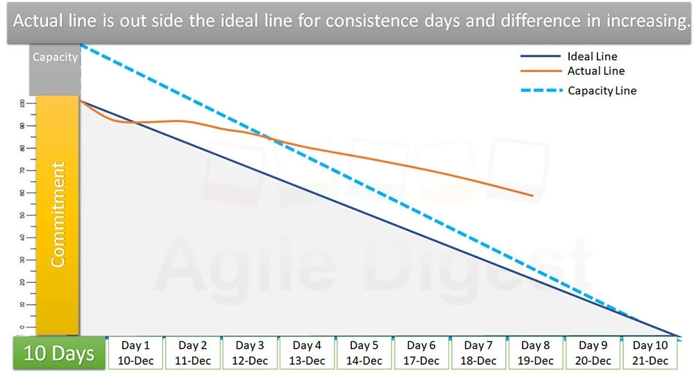
By comparing the actual vs. ideal lines, teams can visually assess sprint health:
- If the actual line is below the ideal, test execution is ahead of schedule.
- If it’s above, the team is lagging.
- Fluctuating lines can signal inconsistencies, resource shortages, or scope changes.
Burndown Chart Example (Real Sprint Example)
To help you visualize how a burndown chart operates in a real-world setting, let’s walk through an example of a typical Agile sprint using a burndown chart.
Sprint Overview
Let’s say your team is tasked with completing a total of 100 test cases during a 10-day sprint. The goal is to have all test cases executed by the end of the sprint. Your burndown chart will track the number of test cases left to complete on a daily basis, giving you an instant overview of how the team is performing.
- X-Axis: Time (Sprint Duration)
The X-axis of the burndown chart will represent the 10 days of the sprint. Each day, the team’s progress will be plotted based on the number of test cases completed.
- Y-Axis: Remaining Work (Test Cases)
The Y-axis will represent the remaining work, starting from 100 test cases and decreasing to 0 as the sprint progresses and test cases are completed.
- Ideal Burndown Line
This is the expected progress line, assuming the team completes an equal number of test cases each day. The ideal line moves smoothly from the starting point (100 test cases) down to 0 on the final day of the sprint.
- Actual Burndown Line
This line reflects real progress based on daily updates. Let’s say on Day 1, the team completed 10 test cases, so the line would drop to 90 remaining test cases. On Day 2, they completed 12 test cases, so the line drops further, and so on.
- Daily Progress and Adjustments
Each day, the actual burndown line will show how much work has been completed. If the team falls behind, say on Day 4, where only 8 test cases are completed instead of the expected 10, the burndown line will appear above the ideal line. This signals a delay and allows the team to take action, such as reallocating resources or prioritizing critical tests.
For example:
- Day 1: Completed 10 test cases → Remaining work = 90
- Day 2: Completed 12 test cases → Remaining work = 78
- Day 3: Completed 10 test cases → Remaining work = 68
- Day 4: Completed 8 test cases → Remaining work = 60
- Day 5: Completed 10 test cases → Remaining work = 50
- Day 6: Completed 10 test cases → Remaining work = 40
- Day 7: Completed 10 test cases → Remaining work = 30
- Day 8: Completed 9 test cases → Remaining work = 21
- Day 9: Completed 11 test cases → Remaining work = 10
- Day 10: Completed 10 test cases → Remaining work = 0
How This Example Helps
This example illustrates how the burndown chart provides transparency into the team’s progress and helps with decision-making. The line clearly shows if the team is ahead of schedule, on track, or falling behind.
In case the actual burndown line remains above the ideal line for several days, it's a clear sign that the team may need to address blockers, add resources, or adjust priorities to stay on track. If the actual line is below the ideal line, the team can maintain its current pace and focus on quality.
Why Burndown Charts Matter in Testing
In modern Agile testing environments, burndown charts are not just simple reports; they are critical tools that help QA teams stay aligned and adaptive. Whether you're running a regression suite, executing new feature test cases, or chasing defect closures, burndown charts provide a crystal-clear picture of where your sprint is heading.
QA testers use burndown charts primarily to track the rate of test execution over time. Instead of manually checking how many test cases are written, done, or pending each day, a burndown chart offers a live, visual snapshot of progress throughout the sprint.
During a typical sprint:
- At the start, the chart begins at the total number of test cases.
- Each day, as test cases are executed (and passed or failed), the chart updates.
- The objective: reach “zero” by the end of the sprint, meaning all planned test cases are completed.
This simple daily visual helps testers:
- Stay focused on sprint objectives, without getting lost in scattered test plans.
- Immediately spot slowdowns, such as blocked test scenarios or delays in build availability.
- Coordinate better with developers, especially when testing is dependent on code fixes or environment readiness.
Benefits for QA Managers, Automation Engineers, and Developers
1. For QA Managers
Burndown charts serve as a strategic control panel. If test execution is lagging behind due to a bottleneck in one module, managers can immediately reassign additional testers or prioritize critical paths. Instead of digging into spreadsheets or waiting for daily stand-ups, they can:
- Visually assess sprint progress in seconds.
- Predict risk early if the execution line is flat or behind the ideal trajectory.
- Make informed decisions on task reassignments or scope adjustments
2. For Automation Engineers
AIO Tests provides an Automation Burndown Report that tracks the rate at which automation is happening. It shows how many test cases were created (at X rate) and how many have been automated (at Y rate), giving a clear picture of the burndown of cases to be automated. This helps automation engineers:
- Monitor real-time automation progress across the sprint.
- Identify mismatches between planned and actual automation.
- Stay on track with automation goals before release deadlines.
3. For Developers
Developers use burndown charts to stay in sync with QA teams. It brings transparency to cross-functional teams and helps promote shared accountability for sprint outcomes.
- Understand how test execution is progressing in relation to their stories.
- Track how fast defects are being verified and closed.
- Spot dependencies like when a bug fix is needed urgently to unblock testers.
Key Use Cases in Test Execution Tracking and Defect Resolution
Burndown charts are incredibly versatile tools for QA teams and Agile testers. They provide more than just progress tracking; they offer insights that help maintain quality and keep releases on track.
Below are some of the most critical ways burndown charts enhance test execution and defect management:
1. Test Execution Progress Tracking
Whether your sprint includes 50 or 500 test cases, knowing how many have been executed daily is essential. A burndown chart visualizes this progress clearly, showing the gap between planned and completed test cases. In short, it transforms raw numbers into a digestible story of sprint health.
- Daily updates enable testers and managers to see if they’re on schedule.
- If the chart line flattens or drops slower than expected, it’s an early sign that testing might not finish on time.
- This visibility drives proactive interventions such as adding resources, reprioritizing tests, or escalating blockers well before the sprint ends.
2. Regression Testing
Regression testing cycles often require running large, complex test suites repeatedly as new features are added or bugs are fixed. Using burndown charts here increases confidence that regression tests won’t delay release timelines. Burndown charts help make regression testing more manageable by:
- Showing completed vs. remaining tests within the regression suite so you can track progress across multiple runs.
- Allowing teams to monitor re-execution of test cases when bugs are fixed or new functionality is integrated.
- Enabling smart workload distribution between manual testers and automation engineers by visualizing coverage and progress.
- Identifying bottlenecks in slow or flaky tests, helping improve automation reliability and reducing test cycle times.
3. Defect Resolution Visibility
Defect tracking is a crucial part of QA, and burndown charts help teams monitor this process in tandem with test execution. Such synchronization between defect tracking and test execution makes the testing process more agile and responsive.
- The chart can be adapted to reflect how many bugs remain open, how many have been fixed, and how many are retested.
- If defect fixes lag behind, the burndown line will plateau or rise, signaling potential blockers.
- This real-time visibility helps developers and QA managers coordinate efforts during bug triages and bug bash sessions.
- Teams can also use this data to prioritize critical bug fixes, ensuring the most impactful issues are resolved first.
4. Scope Change Management
Agile projects often encounter mid-sprint changes like new features, additional test cases, or unexpected bugs that require extra testing. In essence, burndown charts keep scope creep visible and manageable, helping avoid last-minute chaos.
- When new test cases are added during a sprint, the burndown chart will show a spike or upward movement, representing increased work.
- This visual cue allows managers to renegotiate sprint commitments or adjust priorities before the team is overwhelmed.
- It also helps maintain transparency with stakeholders by clearly showing the impact of scope changes on the sprint timeline.
5. Early Warning Indicators
Burndown charts serve as a daily health check for the entire sprint. This proactive insight reduces surprises at sprint reviews and keeps releases on track. Certain patterns can warn of problems early:
- A flat line near the start of the sprint may indicate missing builds or unavailable test environments, stalling testing progress.
- It might also suggest that testers are waiting on development deliverables or are overloaded with other tasks.
- Early identification of these issues gives teams time to resolve dependencies, unblock testing, or adjust sprint goals.
Types of Burndown Chart
Burndown charts are indispensable in Agile and testing environments because they provide clear, visual tracking of work progress over time. There are two fundamental types that cover most needs are the Sprint Burndown Chart, Product Burndown Chart and Testing Burndown Chart.
1. Sprint Burndown Chart
The Sprint Burndown Chart focuses on tracking progress within a single sprint or iteration, usually lasting one to four weeks. It shows how much work remains on the sprint backlog, helping the team measure daily progress toward the sprint goal.
For testers, this chart is invaluable because it makes it easy to visualize test case execution, defect fixes, and task completion over the sprint duration. If the chart’s actual progress line falls behind the ideal line, it’s a clear sign that the team needs to address blockers or reprioritize tasks quickly. This immediate feedback loop fosters transparency and enables agile teams to stay aligned and adjust course proactively.
Key Points:
- Tracks work remaining in a single sprint.
- Provides daily progress updates against sprint goals.
- Helps identify testing bottlenecks early.
- Supports collaboration between testers, developers, and managers.
- Ideal for sprint planning and retrospective analysis.
2. Product Burndown Chart
The Product Burndown Chart offers a higher-level view by tracking progress across multiple sprints toward a product release or major milestone. This longer-term perspective is essential for stakeholders and teams to gauge whether the project is on schedule and to forecast delivery timelines.
For QA teams, the product burndown chart helps ensure that test execution and defect resolution keep pace with development across all sprints. It highlights overall velocity, exposes potential risks in meeting release deadlines, and supports strategic decision-making on scope adjustments and resource management.
Key Points:
- Tracks cumulative work remaining across multiple sprints.
- Offers visibility into release readiness and timeline adherence.
- Helps monitor test coverage and defect resolution progress.
- Facilitates forecasting and strategic planning.
- Enables communication with stakeholders about overall project health.
3. Testing Burndown Chart
A Testing Burndown Chart specifically tracks the progress of test case execution within a sprint or release cycle. Unlike general sprint burndown charts that focus on stories or tasks, this chart helps QA teams visualize how many test cases remain to be executed — day by day. It includes total planned test cases for the cycle, number of test cases executed over time (pass/fail) and a comparison between planned execution rate and actual progress.
This chart is especially useful for identifying testing slowdowns, blocked test scenarios, or delays in test readiness. QA leads can use it to adjust priorities, allocate testers, or escalate issues to ensure testing stays aligned with development timelines.
- Tracks planned vs. executed test cases over time
- Highlights execution bottlenecks
- Helps QA teams stay on schedule
- Drives visibility across manual and automated test efforts
Pro Tips & Common Mistakes in Burndown Charts
A burndown chart shows how much work is left in a sprint and helps teams stay on track. So, let’s look at some tips and common mistakes to avoid.
Pro Tips for Using Burndown Charts Effectively
- Update It Every Day: A chart that isn’t updated regularly won’t show the true picture. Make it a habit to update it daily so everyone knows how the sprint is going.
- Break Big Tasks into Smaller Ones: Large stories often sit untouched for days. Splitting them into smaller tasks makes it easier to track real progress and see steady movement in the chart.
- Include All Types of Work: Don’t just count development work. Add testing, design, review, and anything else that takes time. That way, the chart reflects what the team is actually doing.
- Use It During Team Meetings: A burndown chart can be helpful during daily stand-ups. If the line isn’t moving as expected, it’s a good time to talk about what’s slowing things down.
- Add New Work as Soon as It Comes In: If new tasks are added during the sprint, don’t wait. Add them to the chart right away so the team can adjust.
- Mark Tasks as Done Only When Fully Completed: Don’t mark a task as finished until all parts of it are truly done, including testing or reviews. Half-done work shouldn’t be marked complete.
Common Mistakes That Can Go Wrong
- Skipping Updates: If the chart stays flat for days, it might not mean any progress; it just means that no one is updating it. This can lead to confusion or wrong assumptions.
- Finishing Everything on the Last Day: If all tasks are suddenly marked done at the end, it looks like nothing is happening. It’s better to close tasks as they’re done to reflect the flow of the sprint.
- Expecting the Chart to Follow the Ideal Line: That straight line is a guide, not a rule. Some days will be slower, some faster. What matters is how the team finishes the sprint.
- Leaving Out Last-Minute Tasks or Bugs: If unexpected work comes up and isn’t added to the chart, it won’t match the actual effort. Always add anything that takes time during the sprint.
- Using the Chart to Track Individual Work: This chart shows team progress not who did what. Avoid turning it into a performance report. That can make people hesitant to share real updates.
- Making the Chart Too Complicated: The chart should be easy to read. Avoid adding too many labels, filters, or custom views. A simple, clean chart is more useful for the team.
Conclusion
Burndown charts are practical tools that help QA teams monitor progress and stay on track. These charts provide clear, real-time visibility into test execution progress, helping teams identify bottlenecks and ensure timely delivery. From manual testers to automation engineers and developers, burndown charts help every team member stay updated throughout the testing process.
AIO Tests is a comprehensive AI-powered QA testing and test management app that streamlines the creation of test execution burndown charts. It enables teams to monitor progress, identify issues early, and maintain full visibility throughout the testing lifecycle.
Execute them with clarity and let your burndown chart speak volumes by booking a demo of AIO Tests today.

FAQs
- Why are Burndown charts important for Agile teams?
Burndown charts provide a real-time, visual representation of the team's progress during a sprint. They help teams track the amount of work remaining versus the time left, making it easier to assess whether sprint goals will be met. Burndown charts allow teams to make informed adjustments, reallocate resources, and address potential bottlenecks early..
- What are the different Types of Burndown Charts used in Agile?
There are several types of burndown charts used in Agile, with the most common ones being:
- Sprint Burndown Chart: Tracks the work remaining in a specific sprint or iteration, typically for a 1-4 week period.
- Product Burndown Chart: Tracks the work remaining across multiple sprints toward a larger project goal or product release.
- Testing Burndown Chart: Focuses on tracking test case execution within a sprint, showing progress in test execution, defect resolution, and the overall health of the testing phase.
- What is the difference between sprint burndown and product burndown charts?
The Sprint Burndown Chart focuses on the progress made during a specific sprint or iteration. It tracks the work remaining for that particular sprint and provides insight into whether the team is on track to meet the sprint's goals. Product Burndown Chart provides a broader view, tracking progress across multiple sprints toward the completion of a product release or major milestone.
- What are the common mistakes teams make when using a burndown chart in agile?
Some common mistakes teams make when using burndown charts include:
- Not updating the chart regularly: If the burndown chart isn’t updated daily, it can become inaccurate, leading to confusion and poor decision-making.
- Finishing tasks all at once: Marking tasks as complete only at the end of the sprint can mislead the team into thinking progress is steady when it's actually concentrated at the end.
- Not accounting for scope changes: If new tasks or features are added mid-sprint, they should be immediately reflected in the burndown chart to maintain accuracy.
- Overcomplicating the chart: The burndown chart should be simple and easy to interpret. Adding too many details or custom views can make it harder for the team to use it effectively.
- Using the chart as a performance metric: The burndown chart is for tracking team progress, not individual performance. It should not be used to judge individual contributions.
- How do you create a sprint burndown chart?
To create a sprint burndown chart:
- Define the sprint goal: Clearly outline the tasks or user stories that need to be completed by the end of the sprint.
- Set up the X-axis: Label it with the sprint days (e.g., Day 1, Day 2, ..., Day N).
- Set up the Y-axis: Label it with the total work remaining (e.g., number of test cases, story points, or tasks).
- Plot the Ideal Line: Draw a straight line from the total work at the start of the sprint to zero at the end. This represents the ideal progress.
- Track daily progress: At the end of each day, plot the actual remaining work on the chart to compare it with the ideal line.
- Review and adjust: Use the chart during daily stand-ups and retrospectives to identify if there are any issues or adjustments needed to meet the sprint goal.


